
With reporting season just around the corner, planning and executing the design and production of a printed or digital report can seem like a HUGE task. It doesn’t have to be – early planning and gathering your creative team can ease the stress and set you up for success.
We’ve put together a few tips to get you started…
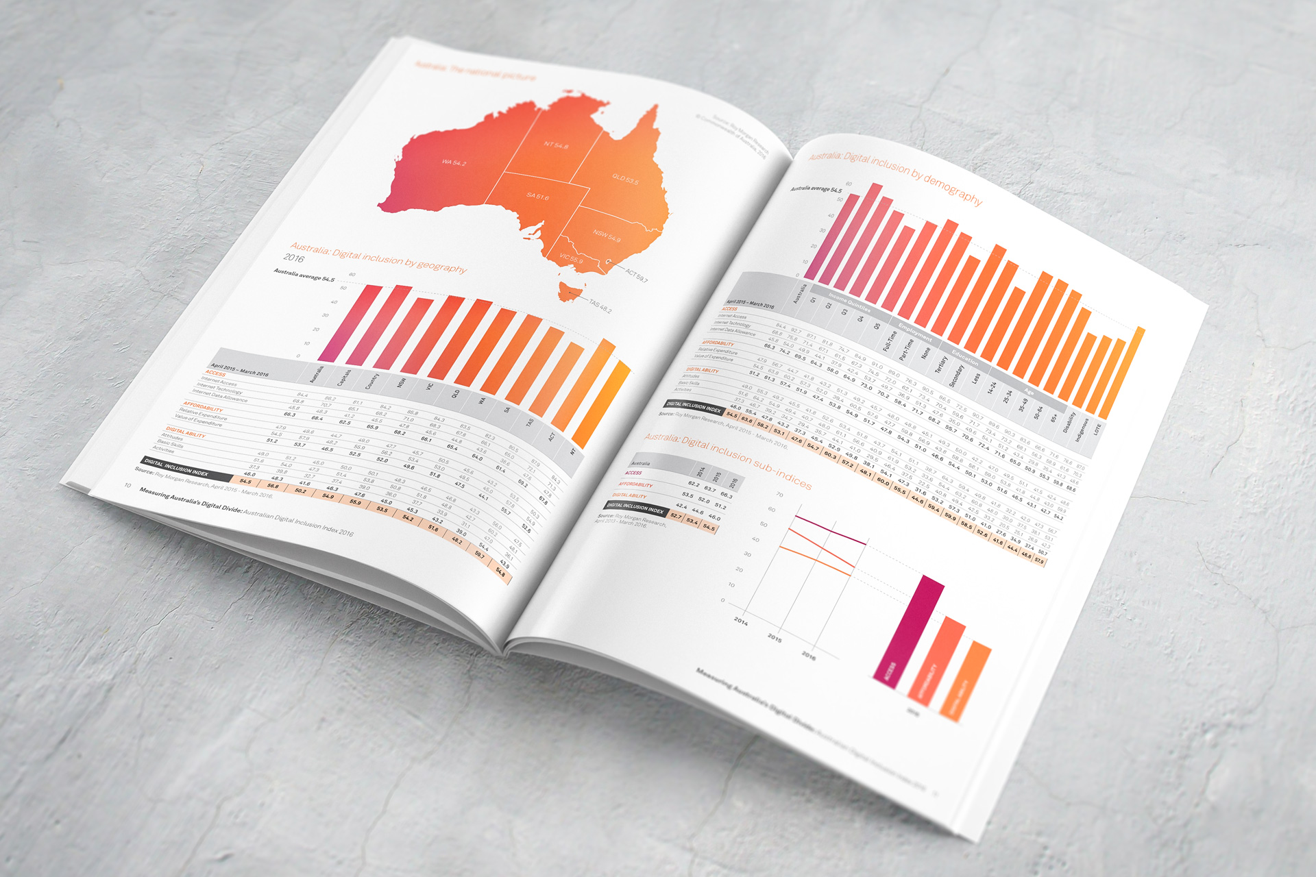
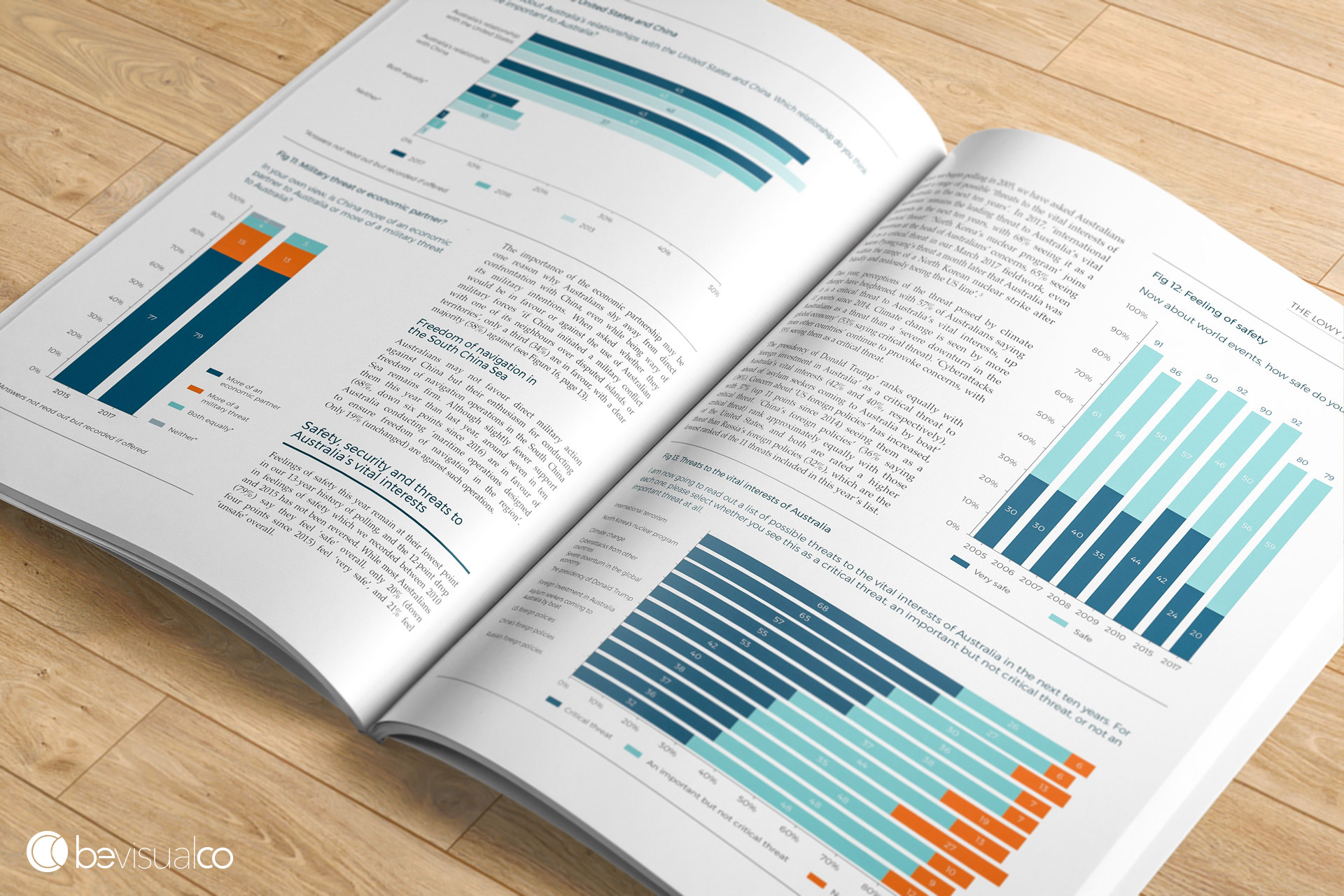
1. Make data visual
Data is always an essential part of an annual report. But it can be dry at times – so it’s important to make this data stand out and be visually interesting. We’re talking data visualisations, charts, breakout quotes, infographics and photography. Getting the balance right will allow those powerful numbers to jump off the page and makes for an impactful report.
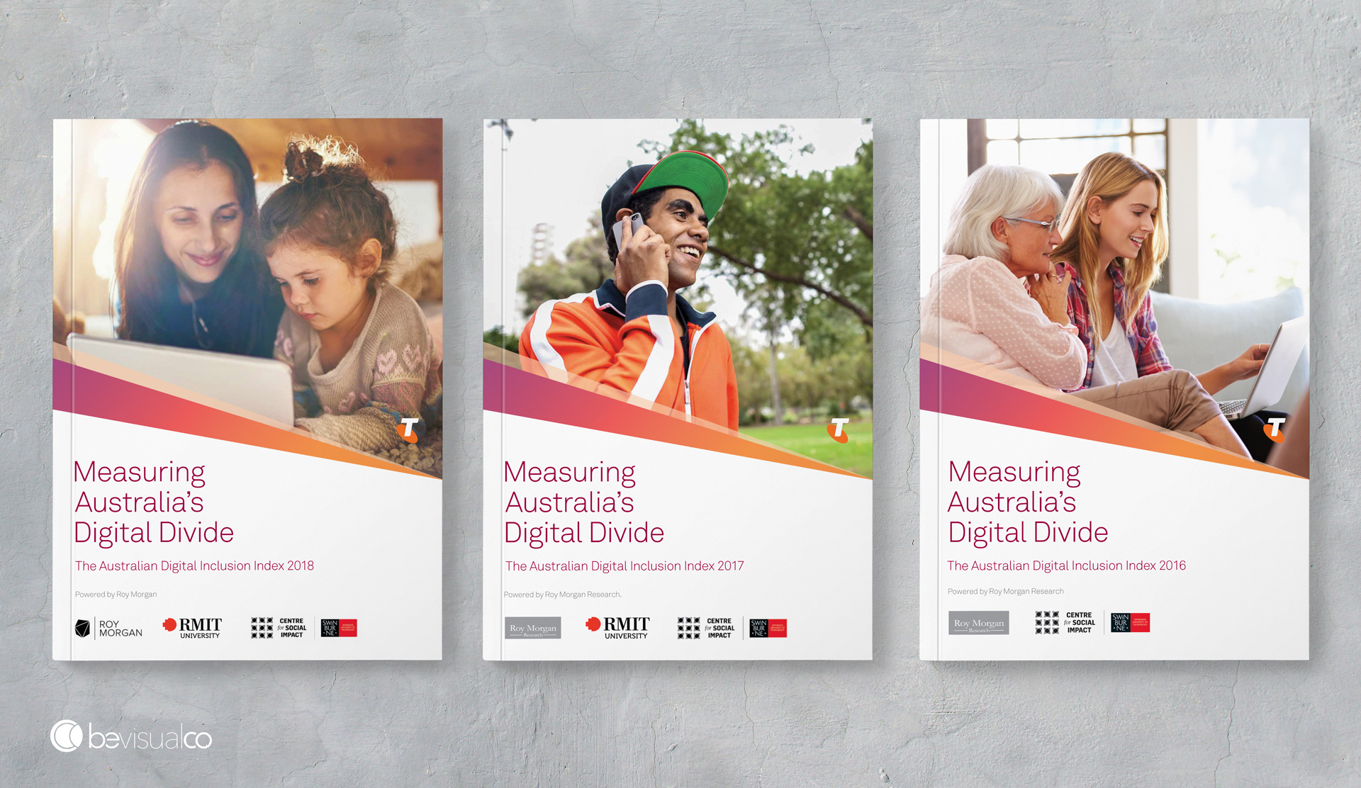
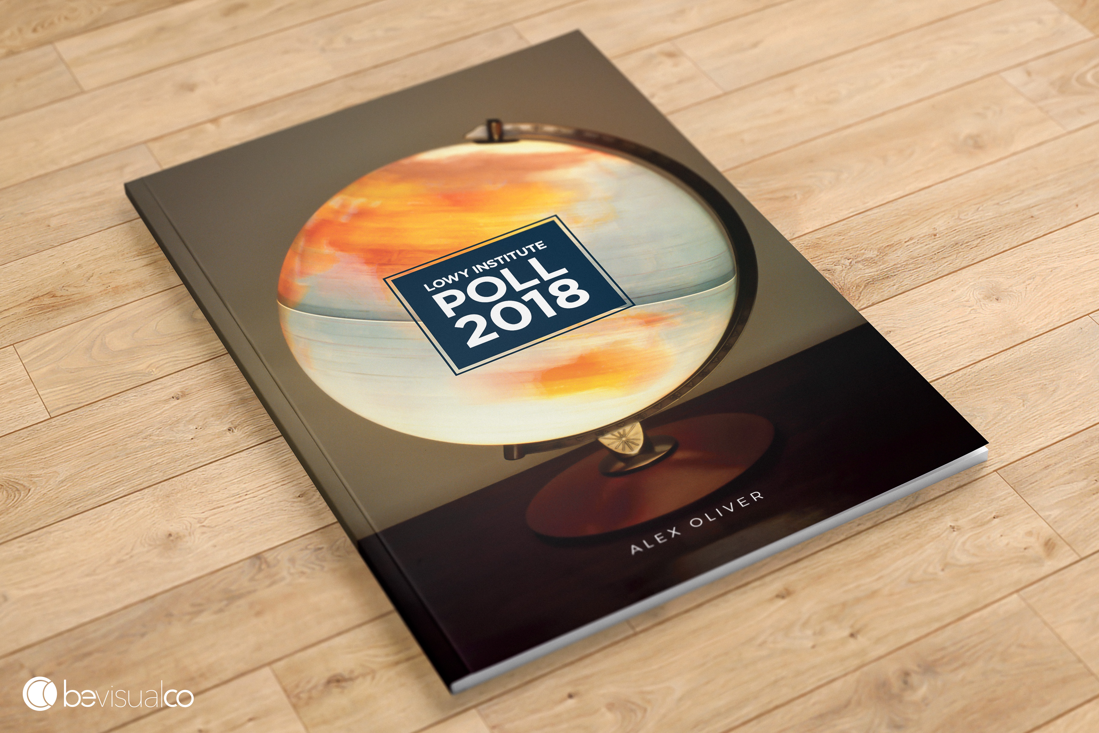
2. First impressions count
The cover really does set the tone for your key messages. This is the page that will be most looked at and recognised. Make a statement, use bold typography and statement imagery. Don’t be afraid to try something new and different from the year before either OR make it subtly consistent if it’s part of a larger suite of reports.
3. Engage your team as early as possible
Creative direction, graphic design, copywriting, fact checking and printing all take time. It’s crucial to start briefing your team early – especially if they’re part of another organisation. To save you time and take the pressure off – put all your suppliers in touch with one another so they can liaise amongst themselves while you oversee things.
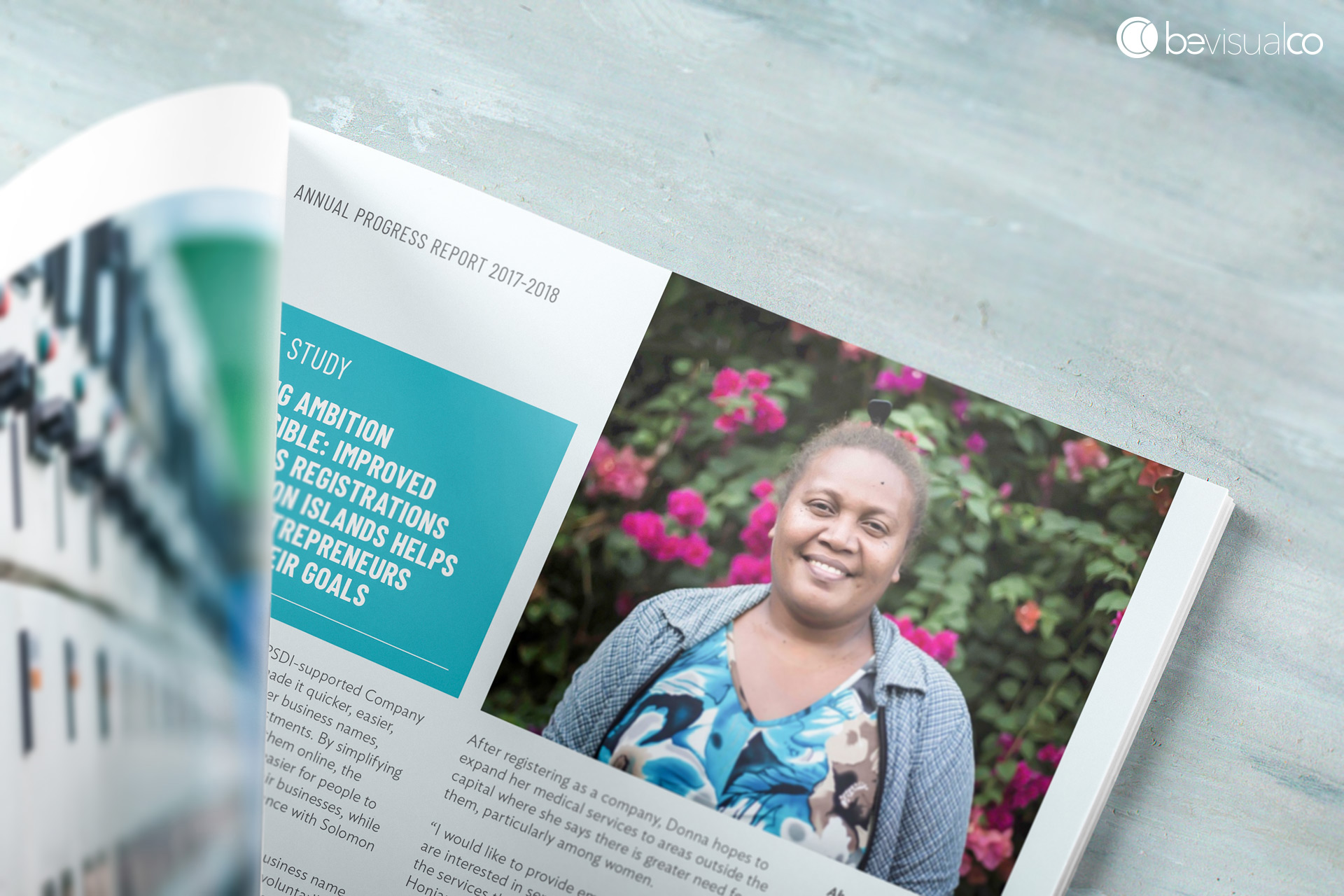
4. A picture says a thousand words
It might be a cliché, but brand aligned stock imagery or custom photography not only breaks up copy throughout a report, it also creates a strong visual representation of key takeouts. Be careful when choosing stock imagery, don’t fall into the trap of images being too cheesy or looking as though they were sourced from overseas. There are some great sites to source free images, and those that are very reasonably priced too.
5. Think outside the box
Don’t be afraid to do something radical. Use colour or graphic elements in unusual way, use a textured stock or even splash out on some specialised printing treatments like spot UV or embossing.
When it comes to your annual report, there are so many benefits of good design: increased engagement, strengthening your brand and – perhaps most importantly – creating a genuine connection with your audience.
Remember:
It’s never too early to start thinking about your next annual report. At Be Visual Co, we’re specialised experts in report design and pride ourselves on the attention-to-detail for crucial corporate documents. We’d love to help bring your report to life.